40 Color Harmony Interior Design Ideas for Balanced Rooms
Achieving color harmony in your interiors is all about finding the right balance. Start with monochromatic designs or experiment with complementary colors for striking contrasts. Try using analogous colors for a soothing effect or a triadic palette for energetic vibes. Don’t forget about layering textures and effective lighting to enhance your color choices. Open spaces require careful coordination, while an eclectic style can blend colors beautifully. Keep exploring for more inspiring tips and ideas!
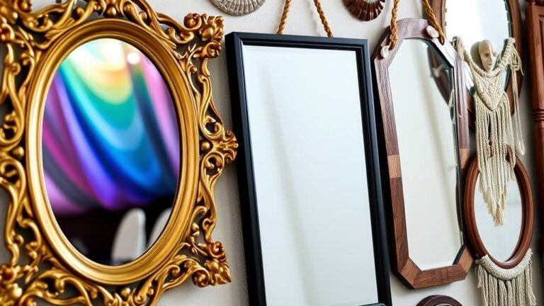
Monochromatic Magic

When you want to create a cohesive look in your space, embracing monochromatic magic can work wonders. By selecting a single color and using different shades, you add color depth that draws the eye. This approach simplifies your design while enhancing visual interest.
To make the most of monochromatic magic, incorporate texture variation. Mix materials like soft fabrics, sleek metals, and rustic wood to create contrast without introducing new colors. For instance, pair a deep navy velvet sofa with lighter cotton pillows and a woven rug. This not only enriches the atmosphere but also maintains harmony.
Monochromatic design is all about balance, allowing you to express your style while ensuring your space feels unified and inviting.
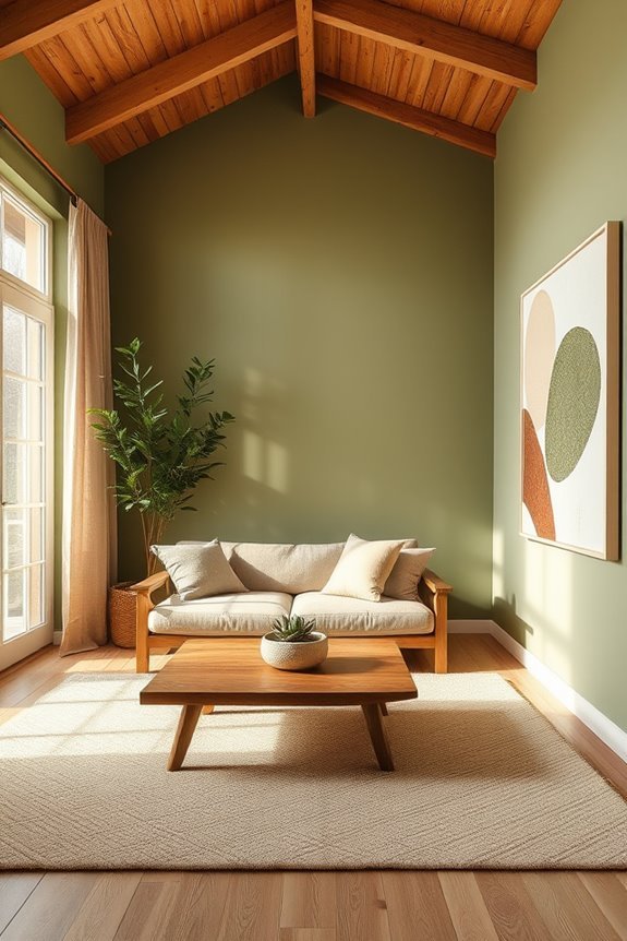
Warm and Cool Color Balance
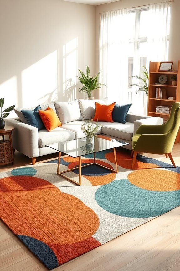
Using triadic color harmony can create a lively atmosphere, but balancing warm and cool colors adds a layer of depth to your design.
When you think about color temperature, warm tones like reds and oranges can energize a space, while cool shades like blues and greens promote calmness.
To achieve visual weight balance, distribute these colors evenly throughout the room. For instance, if you have a warm accent wall, consider cool furnishings or artwork to counteract that intensity.
This interplay not only enhances the room’s aesthetic but also creates an inviting environment.
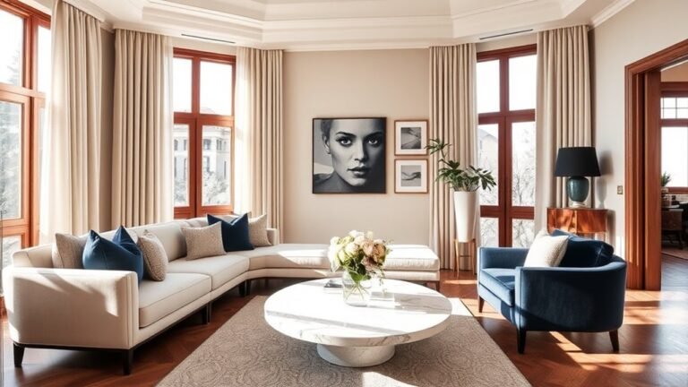
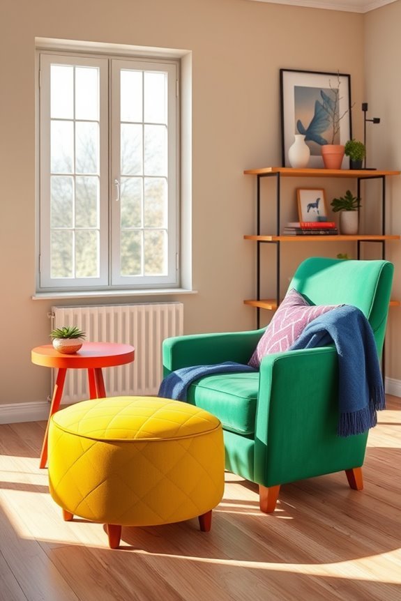
Bold Accents in Neutral Spaces
Incorporating bold accents into neutral spaces can transform a room from bland to vibrant. You can start by selecting bold furniture pieces, like a striking red sofa or a deep blue armchair, to serve as focal points.
These items not only add personality but also create a visual contrast against the soft, muted walls. Enhance the effect with colorful accents, such as vibrant throw pillows, eye-catching artwork, or a patterned rug.
These details bring energy to the space and invite conversation. Don’t shy away from mixing different textures and patterns; it adds depth and interest.
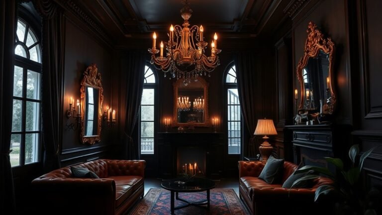
Jewel Tones for Luxury
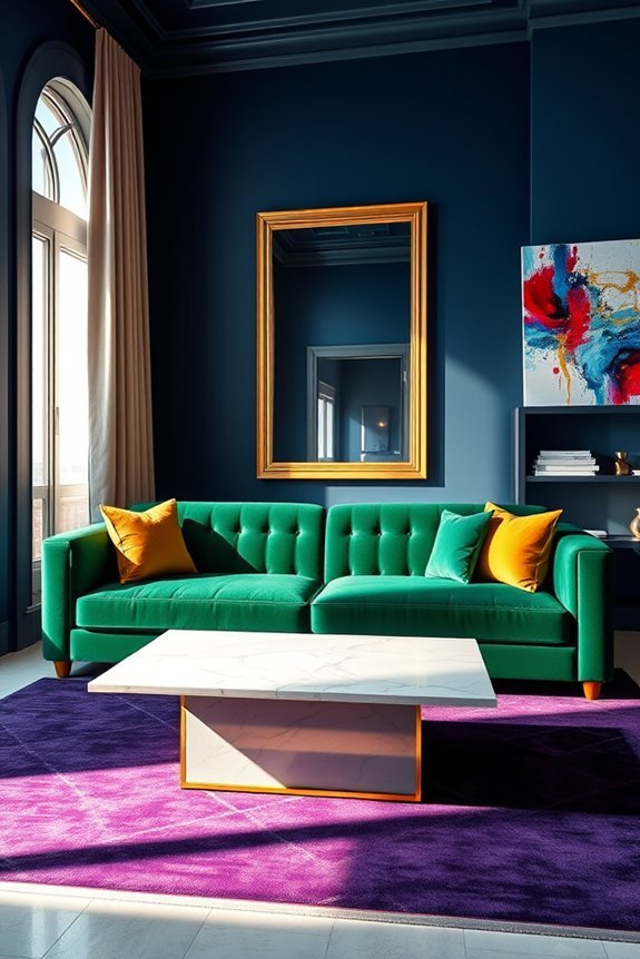
Bold accents can be thrilling, but jewel tones take luxury to another level. Imagine draping your living room in deep emerald greens, rich sapphire blues, or warm ruby reds.
These jewel tone accents create an inviting atmosphere that feels both lavish and cozy. Pairing these hues with neutral tones or metallics can enhance their opulence, leading to stunning, balanced spaces.
For instance, a plush velvet sofa in amethyst can shine against gold or brass accents, while a deep teal wall provides a dramatic backdrop for lighter furnishings.
Don’t shy away from mixing these opulent color combinations; they can bring depth and sophistication to your interiors. Embrace jewel tones, and transform your home into a luxurious haven that captivates the senses.
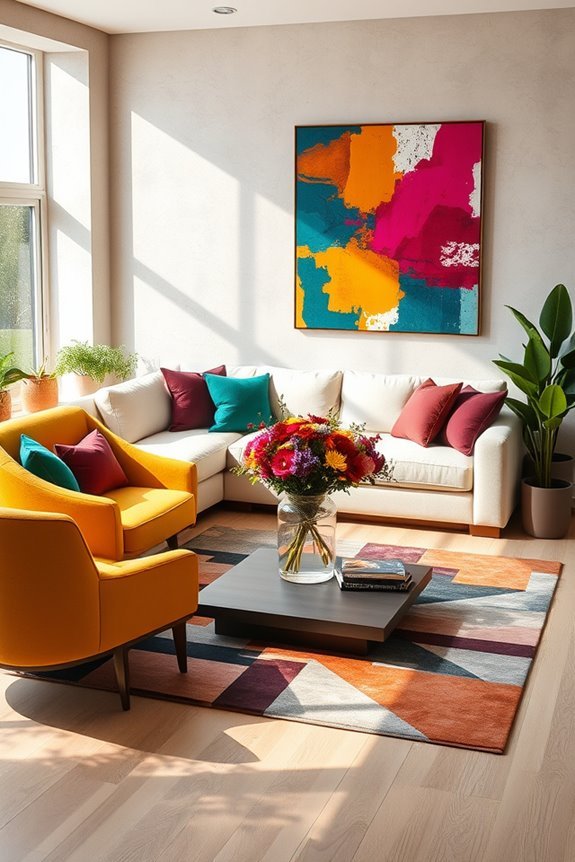
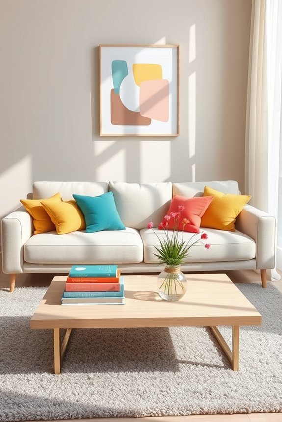
Bright Pops in an Otherwise Neutral Room
Incorporating bright pops of color into an otherwise neutral room can instantly elevate the space and create visual interest. You can achieve this by adding vibrant cushions on your sofa or chairs. Choose cushions in bold hues like teal, mustard, or coral to draw attention and provide a rejuvenating contrast to your neutral palette.
Additionally, consider hanging colorful artwork on your walls. A striking piece can serve as a focal point, bringing life to the room while complementing the overall design. By strategically placing these elements, you’ll create a balanced environment that feels lively yet harmonious.
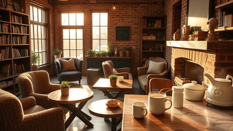
Layering Textures With Color

While you might think color is the only way to bring life to a room, layering textures can add depth and interest that complements your chosen hues. By mixing different materials like soft velvet cushions, woven throws, and sleek leather accents, you create engaging texture combinations that enhance your color layering.
For instance, pair a rich, dark wall color with lighter, textured fabrics to create contrast and warmth. Don’t forget about natural elements like wood or stone, which can ground the space and add a tactile quality.
Nature-Inspired Color Combinations
Bringing nature indoors can transform your space by infusing it with calming vibes and vibrant energy. To create a harmonious environment, consider mixing forest greens with earthy browns for a grounded feel.
Pair ocean blues with twilight purples to evoke the tranquility of water and sky. Incorporate sunset oranges and floral pinks to add warmth and a touch of playfulness.
For a more neutral palette, mountain grays and desert sands bring subtle sophistication, while vibrant yellows can brighten any room. Don’t forget the richness of harvest golds to add depth and warmth.
Coastal Colors for a Breezy Feel
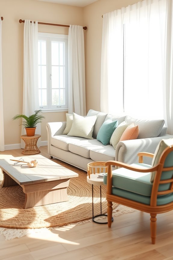
To achieve a breezy feel in your home, consider embracing a palette inspired by the coastal landscape.
Think soft whites, sandy beiges, and light blues that mimic ocean hues and create a serene atmosphere. Incorporate beachy vibes through accents like seafoam green pillows or driftwood decor.
You can also use light fabrics, such as linen or cotton, to enhance that airy feeling. Painting your walls in a pale aqua or sea glass shade can instantly evoke a coastal retreat.
Don’t forget to add natural elements like coral or seashells to tie everything together. By selecting these colors and textures, you’ll create a harmonious space that brings the tranquility of the coast right into your home.
Vintage Color Schemes
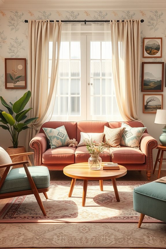
If you want to evoke a sense of nostalgia in your space, vintage color schemes can work wonders. Embrace muted palettes that reflect timeless aesthetics, blending faded textiles and classic patterns for an inviting atmosphere.
Incorporate vintage wallpaper adorned with intricate designs to create focal points, while retro furnishings add character and charm. Antique accents, like weathered frames or vintage lighting, enhance the rustic charm of your décor.
Mix and match these elements to embody nostalgia decor that transports you to another era. By carefully curating these components, you’ll achieve a harmonious look that feels both stylish and cozy, making your space a perfect retreat filled with warmth and history.
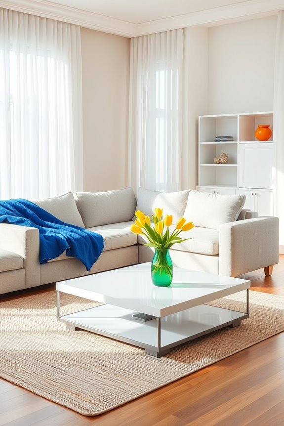
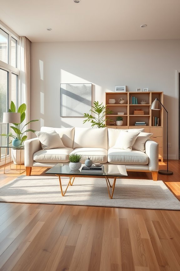
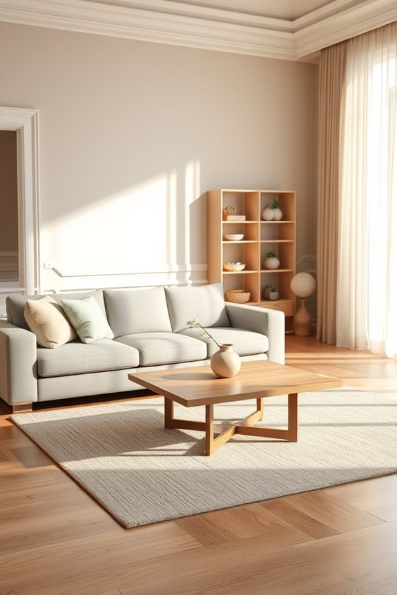
Bright Whites for Airy Spaces

While bright whites can seem stark, they actually create an airy and open atmosphere when used thoughtfully in your space. By painting your walls with bright whites, you can enhance natural light, making the room feel larger and more inviting.
To achieve airy aesthetics, balance bright whites with soft textures and subtle accents. Consider white furniture or light-colored fabrics that complement your bright walls without overwhelming the senses.
Incorporate greenery or colorful artwork to add contrast and warmth, ensuring your space feels vibrant yet serene. Remember, the key is to layer different elements harmoniously to maintain that airy feel.
With the right approach, bright whites can transform your room into a rejuvenating sanctuary.
Bright Yellows for Cheerfulness
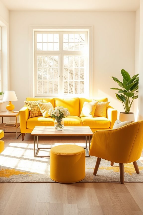
Bright yellows infuse any room with a sense of cheerfulness and energy. If you want to create sunny spaces, consider painting an accent wall in a bold shade of yellow. This vibrant color can instantly uplift your mood and brighten your day.
Pair it with white or neutral furniture to let the yellow shine, or introduce vibrant accents like pillows and artwork that complement the hue. You can also incorporate yellow through decor items such as vases, rugs, or even curtains, bringing warmth and light to your home.
For a more balanced look, mix yellow with other bright colors, creating a lively atmosphere. Embrace the joy of bright yellows to transform your living area into a welcoming haven.
Rich Reds for Passionate Spaces
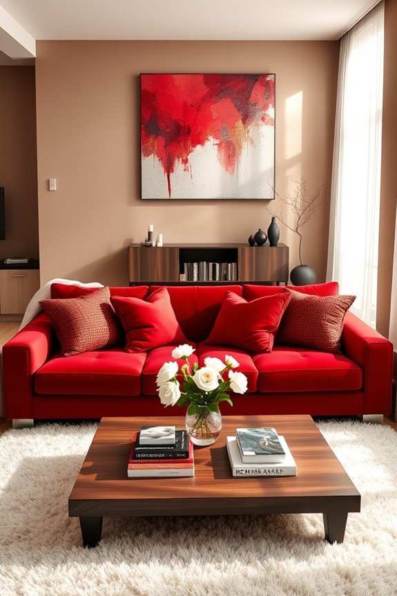
When you incorporate rich reds into your interior design, you instantly create a space that exudes passion and energy. These bold hues can transform a room, making it feel vibrant and inviting.
Use rich red accents, like throw pillows or rugs, to add warmth without overwhelming the space. Consider painting an accent wall in a deep red to serve as a stunning backdrop for passionate wall art that draws the eye.
This combination not only enhances the room’s aesthetic but also sparks conversation and creativity. Balance the intensity of reds with softer tones to keep the atmosphere inviting.
Color Blocking Techniques

Color blocking can instantly elevate the design of any room, creating a bold and dynamic look.
To master the color blocking basics, start by selecting two or three complementary colors. Think about how these creative color combinations can work together to draw the eye and energize the space.
You might choose a vibrant hue for an accent wall, then balance it with softer tones for furniture or decor. Experiment with different shapes and sizes, like geometric patterns, to add depth.
Don’t forget to incorporate neutral colors to prevent overwhelming the room.
With a little practice, you’ll find that color blocking not only enhances aesthetics but also reflects your personality and style.
Go ahead, release your creativity!
Color-Infused Furniture Choices
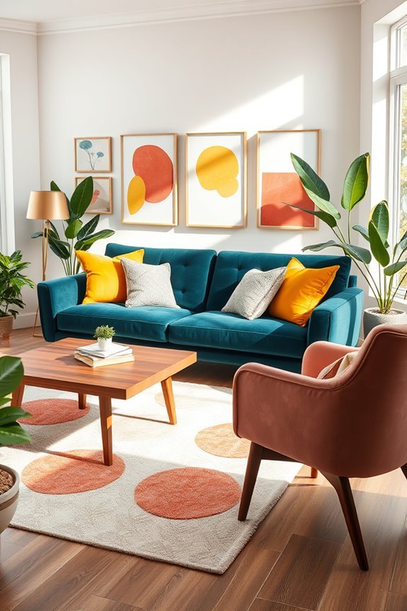
Revitalizing your space with seasonal colors doesn’t stop at accessories; furniture plays a significant role in setting the mood.
Choosing pieces with colorful upholstery can instantly elevate your room’s vibe. Think about a bold sofa in a rich teal or a striking mustard yellow. These hues can act as a focal point, drawing the eye and enhancing your overall design.
Don’t forget about vibrant accent chairs—they’re perfect for adding personality without overwhelming the space. Pair them with neutral furniture to create a balanced look.
Harmonizing Patterns and Colors

When you blend patterns and colors in your space, you create a dynamic and inviting atmosphere that reflects your personal style.
Start with a cohesive color palette that connects your patterns; this will make pattern mixing feel intentional rather than chaotic. Think about color symbolism—different hues evoke various feelings and moods. For example, blues can bring calmness, while yellows add cheerfulness.
Choose a dominant pattern for your larger pieces, like a sofa or rug, and layer in smaller, complementary patterns through cushions or artwork.
Balance is key; mix bold patterns with subtler ones to avoid overwhelming the senses. By harmonizing patterns and colors, you’ll achieve a space that’s not only stylish but also uniquely yours.
Neutral Base With Colorful Accessories
Creating a neutral base in your room allows colorful accessories to truly shine. Start with neutral furniture, like a beige sofa or cream-colored chairs, to set a calming foundation.
Layer in colorful rugs that bring warmth and energy to the space. Choose accent pillows and patterned cushions in vibrant hues to add comfort and style.
Incorporate vibrant artwork that draws the eye, along with decorative vases filled with fresh blooms. Playful curtains can frame your windows beautifully, while bright throws draped over furniture inject a cozy feel.
Don’t forget chic lamps as functional art pieces and colorful sculptures that serve as conversation starters. This approach creates a balanced, inviting atmosphere where each accessory stands out.
Using Lighting to Enhance Colors
Since the right lighting can dramatically change how colors appear in a room, it’s essential to choose fixtures that complement your design.
Ambient lighting plays a significant role in setting the mood and enhancing color harmony. Opt for warm color temperatures to create a cozy atmosphere, making rich hues like deep blues or warm reds pop.
On the other hand, cooler color temperatures can bring out the freshness in pastel shades and whites. Use dimmers to adjust the intensity, allowing you to fine-tune the ambiance for different occasions.
By thoughtfully combining various light sources—like overhead fixtures, lamps, and sconces—you can achieve a balanced look that highlights your room’s color palette beautifully.
Experiment and see what works best for your space!
Accent Furniture in Vibrant Hues
Incorporating accent furniture in vibrant hues can add a lively focal point to your room, enhancing the harmony established by your textiles.
Consider introducing vibrant chairs that draw the eye and bring energy to your space. These bold pieces can serve as conversation starters while complementing your existing decor.
Colorful ottomans are another fantastic option; they not only provide extra seating but also inject personality and warmth into your room.
Mix and match different colors and patterns to create a playful yet balanced atmosphere.
Remember, the key is to maintain cohesion with your overall color palette while allowing these accent pieces to shine.
You’ll find that a few well-placed, vibrant furniture items can transform your room into a vibrant sanctuary.
Decorative Art Pieces With Color Impact

How can you elevate your room’s aesthetic with decorative art pieces that pack a color punch? Think about incorporating artistic sculptures that draw the eye and add depth. A bold sculpture in a vibrant hue can serve as a stunning focal point, instantly transforming your space.
Pair these with vibrant prints that complement your existing color palette, creating a cohesive look that feels both lively and balanced. Consider large canvas artworks that splash color across your walls, or framed prints that feature striking designs.
Color Psychology in Design
Art pieces not only add vibrancy but also evoke emotions that influence the overall ambiance of your space. Understanding color psychology is essential for creating harmony in your design.
Different colors carry specific color associations; for instance, blue often promotes calmness, while yellow can spark happiness. By choosing colors that align with the emotional responses you want to evoke, you can transform a room’s atmosphere.
Consider how you want to feel in each space—do you seek relaxation in a bedroom or inspiration in a home office? By thoughtfully selecting color palettes, you can enhance your environment, making it not just visually appealing but also emotionally resonant.
Ultimately, your choices can lead to a more balanced and harmonious home.
Layered Lighting for Color Enhancement
While choosing the right colors can set the mood of a room, layered lighting plays an essential role in enhancing those colors. By incorporating different types of light sources, you can create ambient brightness that brings your chosen palette to life.
Start with overhead lighting for general illumination, then add task lighting for specific activities and accent lighting to highlight artwork or architectural features. This approach not only provides functional light but also creates layered shadows that add depth and dimension.
Experiment with dimmers to adjust the intensity and create varying atmospheres throughout the day. With thoughtful lighting, your colors can appear richer and more vibrant, transforming your space into a harmonious retreat.
Open Floor Plans and Color Coordination

When you embrace an open floor plan, coordinating colors becomes essential to create a cohesive flow throughout the space.
Start by selecting a color palette that resonates with your style—think of shades that complement each other while maintaining harmony. Use a dominant color for larger areas, like walls, and introduce accent colors through furniture and decor. This approach enhances the visual connection between different zones, ensuring a smooth color flow.
Don’t forget about texture; incorporating various materials can add depth without overwhelming your palette.
Finally, consider the natural light in your open floor design, as it can influence how colors appear throughout the day. By thoughtfully coordinating colors, you’ll achieve a balanced, inviting atmosphere.
Eclectic Style With Color Balance

Embracing an eclectic style allows you to blend a variety of colors and patterns, creating a vibrant, personalized space.
To achieve harmony, focus on eclectic color palettes that complement each other. Consider using bold hues alongside softer shades to balance the visual impact of your room.
When arranging your furniture, aim for a balanced furniture arrangement that allows each piece to shine without overwhelming the space. Group items with similar styles or colors to create cohesion while still allowing for diversity.
Incorporate unique accessories, textures, and artworks that resonate with your personality. This way, you’ll maintain a lively atmosphere while ensuring that your eclectic decor feels intentional and well-coordinated.
Enjoy the process of self-expression through your carefully curated design!
Sustainable Colors for Eco-Friendly Spaces
Incorporating sustainable colors into your interior design not only enhances your space but also reflects your commitment to eco-friendliness.
Earth-friendly hues like soft greens, warm browns, and muted blues evoke nature and create a calming atmosphere. When choosing paint or fabrics, opt for sustainable materials that minimize environmental impact.
Look for low-VOC paints and organic textiles that maintain your aesthetic while supporting eco-conscious practices. Pair these colors with natural wood accents or recycled materials to further enhance your design.
Conclusion
Incorporating color harmony into your interior design is like weaving a beautiful tapestry; each hue threads together, creating a cohesive and inviting space. Whether you choose a monochromatic scheme or playful complementary colors, the key is balance. Embrace the warmth of layered lighting and coordinate colors across open floor plans to achieve a seamless flow. Remember, your home should reflect your personality while offering a sense of peace—like a well-composed symphony that resonates with every note.