How to Choose the Right Color Scheme for Your Home
Start by noting how each room’s natural light changes through the day and pick a base color family—warm or cool—that suits your architecture and lifestyle. Use neutrals on large surfaces to unify connected spaces, then add one or two accent colors in textiles, art, and fixtures to create contrast and mood. Match paint undertones to your flooring and metal finishes, and test swatches on walls at different times; keep going to get practical tips for finishes and shifts.
Understanding Color Psychology for Living Spaces
Mood guides how you feel in a room, so choose colors that support the purpose you want each space to serve. You’ll use color associations to signal energy or calm: warm hues boost activity, cool tones soothe, and neutrals stabilize.
Think about emotional impact before picking paint—what feeling do you want to evoke when you enter? Test swatches on walls and imagine daily routines there; don’t rely solely on samples.
Balance bold accents with grounding backgrounds so moods shift intentionally. By focusing on purpose-driven choices, you’ll create living spaces that consistently support how you want to live.
Assessing Your Home’s Natural Light
You’ve picked colors to shape how rooms feel, but natural light will change those hues every hour — and you should know how.
Walk each room at morning, midday, and late afternoon to note direction, shadows, and color shifts. South-facing spaces get steady light; north-facing stay cooler and softer.
Measure light intensity informally by how bright walls look against a neutral sample; if colors look muted, pick warmer or lighter tones.
Consider obstructions like trees or neighboring buildings that reduce intensity. Record findings so you select finishes that perform reliably under your home’s actual lighting conditions.
Matching Color Schemes to Architectural Style
Think about the era of your home and choose a palette that feels authentic to that period.
Use color to underscore key architectural details—trim, molding, or built-ins—so they read clearly.
You’ll keep the overall look cohesive by balancing historic hues with any modern updates.
Match Era With Palette
When you choose colors that echo your home’s architectural era, the whole design feels cohesive and intentional; Victorians lean toward jewel tones and ornate contrasts, mid-century modern favors warm woods and muted teals, and Colonial styles often use restrained, historic neutrals.
You’ll balance vintage styles with modern aesthetics by picking palettes that respect original character while updating finishes. Consider scale, trim, and period materials so color enhances, not fights, the structure.
- Match base tones to original materials for authenticity.
- Use accent colors sparingly to modernize without erasing history.
- Test samples in varied light before committing.
Highlight Architectural Details
Make your architectural details sing by choosing colors that reinforce their shape and purpose rather than hide them. You’ll pick trims, moldings, and brackets to draw the eye, highlighting textures like wood grain or stone.
Use slightly lighter or darker tones to define cornices and window casings, and apply bolder accents where you want focal points. Emphasizing contrasts around doorways and staircases creates depth without overwhelming the room.
Keep large surfaces neutral so details stand out, and test swatches in different light. With intentional choices, your color scheme will celebrate structure and craft instead of obscuring it.
Choosing a Base Color for Cohesion
Start by picking one base color that will anchor your whole scheme, because that single choice sets the tone and simplifies decisions for walls, major furniture, and large rugs.
You’ll use that as your foundation to build a cohesive design throughout rooms. Consider light, mid, or deep hues among base color options to suit natural light and room size.
Decide on a finish that complements function—matte for walls, durable satin for high-traffic areas. Trust the base to harmonize wood tones and large textiles.
Revisit adjacent rooms to confirm your choice flows and reinforces a unified home.
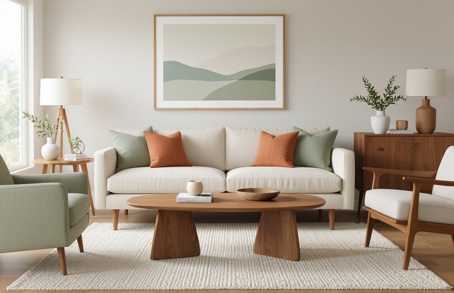
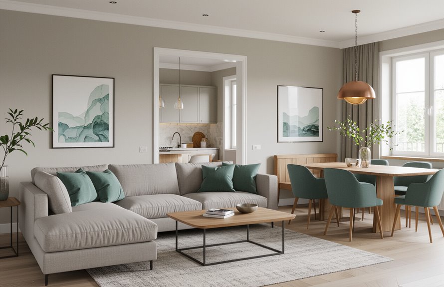
Creating Contrast With Accent Colors
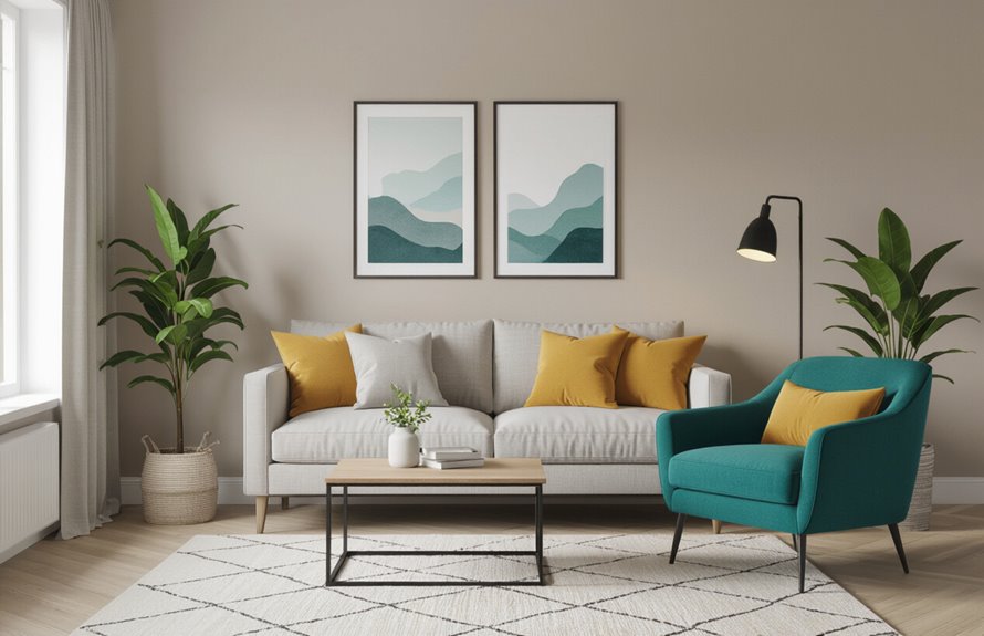
Contrast gives your rooms energy and prevents the base color from feeling flat, so pick one or two accent colors that stand out against your foundation and repeat them in small doses—throw pillows, trim, artwork, or a statement chair.
You’ll use contrast techniques like pairing warm with cool tones or light with dark to direct attention and define zones.
Try tested accent color combinations—teal with coral, navy with mustard, or sage with terracotta—to create mood without overwhelming.
Apply accents deliberately: anchor a vignette, balance opposite walls, or layer textures.
Keep scale and frequency consistent so accents energize rather than compete.
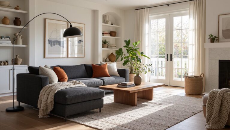
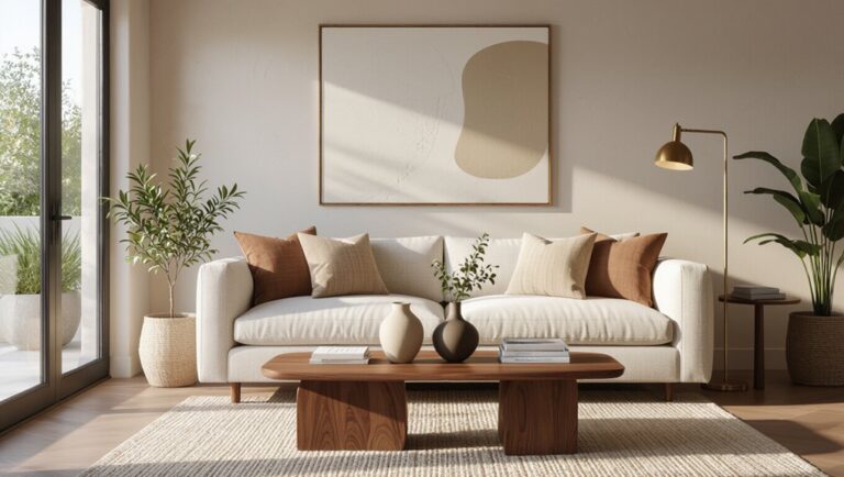
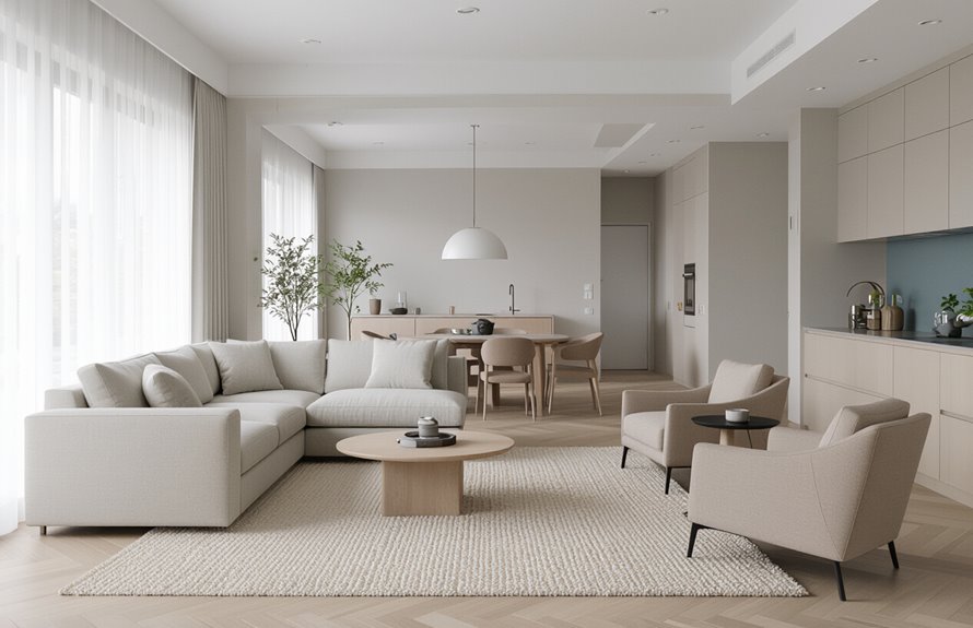
Using Neutrals Effectively
After you’ve used accents to punctuate a room, neutrals will hold everything together and give your eye a place to rest.
You’ll rely on neutral color combinations to create cohesion, layering warm and cool tones for depth. Use texture, matte and gloss finishes, and varied fabrics so neutrals feel intentional, not flat.
Effective neutral accents—like a charcoal throw or sandy rug—anchor seating and pathways. Keep contrasts subtle to preserve calm, and repeat one or two neutral tones across rooms for flow.
Balance proportion: let neutrals dominate, then reintroduce color accents sparingly to maintain interest.
- Layer textures
- Repeat tones
- Anchor with accents
Selecting Color Palettes for Small Rooms
When you’re working with a small room, choose a palette that enlarges the space rather than competing with it: favor light, slightly warm or cool neutrals on walls and ceilings, then add one or two restrained accent colors to create depth without clutter.
Use tonal variations to establish color depth—lighter shades for large surfaces, slightly darker ones for trim or furniture—to maintain cohesion.
Keep pattern mixing minimal: pair a subtle geometric rug with a small-scale floral cushion or striped throw to add interest without overwhelming sightlines.
Stick to a unified undertone so light bounces freely and the room feels airy.
Color Strategies for Open-Plan Living Areas
In open-plan spaces you’ll want a unified base palette to keep the whole area feeling cohesive.
Use zone-defining accents—like a richer wall color, an accent rug, or painted shelving—to signal living, dining, and work areas.
Keep the accents tied to your base palette so shifts feel intentional, not jarring.
Unified Base Palette
Because open-plan spaces flow into each other, pick a unified base palette that ties rooms together and makes the whole feel intentional; choose two to three neutrals or muted tones as your foundation, then use texture and finish to create subtle distinction without breaking the visual continuity.
You’ll get consistent color harmony and subtle mood enhancement across living, dining, and kitchen zones. Keep contrast low for calm, raise it for energy, and coordinate warm or cool undertones.
Consider these approaches:
- Matte warm taupe walls, satin trim, textured rugs.
- Cool greige on main planes, linen upholstery accents.
- Soft white ceilings, tactile wood finishes.
Zone-Defining Accents
Although open-plan rooms share a base palette, you can stake out distinct zones with targeted accent colors that guide the eye and signal function.
Use a consistent neutral backdrop, then assign each area a restrained accent hue—warm ochre for dining, cool teal for lounging, or leafy green for work.
Layer colorful textiles like rugs and cushions to reinforce boundaries without heavy partitions.
Add vibrant accessories—lamps, vases, art—to punctuate each zone and link accents back to the base palette.
Keep repetition and scale in mind so changes feel intentional, cohesive, and easy to update.
Coordinating Colors Across Connected Rooms
Open sightlines and shared activities make the colors you choose for adjacent rooms feel like a conversation, so pick hues that relate rather than compete. You’ll create smooth color flow and thoughtful room transitions by choosing a dominant palette, repeating an accent, and using neutral anchors.
Try these steps:
- Pick a primary family (warm or cool) for continuity, then vary saturation.
- Repeat an accent color in textiles or art to tie spaces without matching exactly.
- Use neutrals on trim or large furniture to balance contrast and allow each room to keep its own identity.
These moves help your connected rooms feel cohesive.
Balancing Warm and Cool Tones
When you mix warm and cool tones, aim for intentional contrast so spaces feel lively without clashing. You’ll pick a dominant temperature—warm tone combinations for coziness or cool tone accents for calm—and balance them with neutrals.
Use warm tone combinations in larger areas like walls or upholstery, then add cool tone accents in smaller doses: pillows, art, or trim. Keep undertones aligned (yellow vs. blue) to avoid discord.
Test colors together under your home’s light before committing. Move elements between rooms to guarantee flow, and trust your eye to tweak proportions until the balance feels right.
Incorporating Textures to Enhance Color
Because texture changes how color reads, layering tactile finishes makes hues feel richer and more intentional.
You’ll use texture layering to control depth: matte paint lets color recede, gloss highlights accents, and woven fabrics add warmth.
Combine tactile materials to create contrast without changing hue—think plaster walls, linen curtains, and metal fixtures that catch light.
Use the same color in different textures to test harmony and mood.
Repeat one textured element to unify a room.
Balance scale so textures don’t compete; let one dominate while others support.
This approach sharpens color impact and invites touch.
- Matte, gloss, fabric
- Plaster, wood, metal
- Rugs, pillows, throws
Picking Colors That Complement Flooring and Fixtures
When you pick paint or fabrics, match undertones rather than just chasing similar shades so wood and tile look cohesive.
Check how your colors coordinate with metal finishes like brass, chrome, or matte black to keep fixtures from clashing.
Aim for a balance of contrast and continuity so rooms feel intentional without being monotonous.
Match Undertones, Not Just Shades
Although two colors may look similar in brightness, their undertones can clash, so focus on matching those subtle hues to your flooring and fixtures.
You want color temperature and color harmony to guide choices, so test swatches near natural and artificial light. Consider these steps:
- Observe flooring and fixture undertones (warm, cool, neutral) and pick paint that complements, not just matches.
- Place large swatches on walls and live with them at different times to confirm consistent harmony.
- Use trim or an accent color to bridge slight undertone differences without overwhelming the room.
Coordinate With Metal Finishes
If your fixtures and hardware lean warm (brass, oil-rubbed bronze) or cool (chrome, brushed nickel), pick wall and floor colors that echo that temperature so everything reads as intentional; neutral metals like stainless can work with either palette but benefit from a clear leaning toward warm or cool in surrounding finishes.
You’ll want metallic accents repeated in small doses—lighting, cabinet pulls, or frames—to tie rooms together. Test paint and flooring beside a sample of your metal finish to confirm finish compatibility and avoid clashes.
When in doubt, choose a subtle undertone that complements rather than competes with fixtures.
Balance Contrast and Continuity
You’ve already considered how metal finishes set a temperature for a room; now turn to how colors relate to the larger elements they sit on and against.
You’ll aim for color harmony between walls, flooring, and fixtures while keeping enough contrast for visual impact. Balance continuity so shifts feel intentional, not accidental.
- Match undertones: compare warm or cool bases in floors and fixtures before picking paint.
- Use a dominant, secondary, and accent color to maintain flow without monotony.
- Test samples at different light levels to confirm contrast and cohesive appearance.
How to Test Paint Samples Properly
Before you commit to a full gallon, test paint samples in the actual room to see how light, furnishings, and wall texture change the color. Buy small paint swatches and larger color samples, apply them to different walls, and observe at several times of day. Use peel-and-stick cards and painted 12×12″ boards you can move. Note undertones and glare, and rule out colors that shift badly under artificial light.
| Location | Observation |
|---|---|
| North wall | Cooler, muted |
| Near window | Brighter, warmer |
Record results before choosing the final shade.
Working With Existing Furniture and Artwork
When picking a color scheme around existing furniture and artwork, start by identifying the dominant and accent colors in those pieces so you can build a palette that complements rather than competes with them.
You’ll work smarter if you treat furniture color coordination and artwork color integration as one task: balance tones, repeat accents, and respect scale.
Try these steps:
- Pull three colors from a key piece (dominant, mid, accent) and test them as wall and trim options.
- Use neutrals to unify varied textiles and finishes without dulling artwork.
- Add one accent hue in accessories to echo art and tie furniture together.
Using Color to Define Zones in Multipurpose Rooms
If a room has to serve two or three functions, use color to signal each zone so your brain instantly understands what belongs where. You can use color blocking on walls or rugs to separate a work nook from a lounge area, or paint a shelving unit to anchor a play corner.
Choose hues that relate but contrast enough to form visual boundaries, helping activities feel distinct. Keep trim and ceilings neutral so separations stay clean. Use consistent accent colors to tie zones together without blurring purpose.
Small changes—an area rug, a painted stripe—create clear, functional divisions.
Seasonal Color Adjustments and Flexibility
Although the bones of your palette should stay consistent, swapping accents and textiles lets you shift a room’s mood with the seasons without repainting.
You’ll keep cohesion while embracing seasonal themes and preserve color flexibility by rotating small elements.
- Swap throw pillows and rugs to introduce warmer or cooler tones each season.
- Change artwork and vases for quick, budget-friendly updates that echo seasonal themes.
- Use slipcovers, curtains, and lamp shades to test bolder hues before committing, maintaining overall balance and color flexibility.
These simple swaps let you refresh spaces frequently without disrupting the core scheme.
Trends vs. Timeless Color Choices
You’ll want to know which current popular palettes feel fresh and which colors will still look good years from now.
Consider longevity and durability when choosing bold accents so you’re not repainting every season.
You can blend trendy hues with classic neutrals to get interest without committing to a short-lived look.
Current Popular Palettes
When picking a palette, weigh current trends against timeless choices so your space feels fresh now and still works years from now.
You’ll spot mixes that balance bold color with muted tones, earthy palettes softened by pastel hues, or monochromatic schemes with vibrant accents.
Choose harmonious blends if you want cohesion, or try contrasting shades for drama.
Think about how each room’s purpose guides intensity.
- Contemporary: bold color focal walls with muted tones elsewhere.
- Calm: earthy palettes, pastel hues, and monochromatic schemes.
- Eclectic: vibrant accents, contrasting shades, and harmonious blends.
Longevity and Durability
Because trends shift faster than the paint on your walls, think about how long you want a color to work before committing to it—are you aiming for a quick seasonal refresh or a palette that’ll still suit the space in five to ten years?
Choose hues with proven color durability for long-term satisfaction; neutrals and muted tones often age gracefully in varied lighting.
Consider rooms’ sunlight levels and pick finishes and pigments with strong fade resistance where needed.
If you expect to keep colors for years, favor classics that mask wear and pair well with changing furniture, art, and decor.
Blending Trends With Classics
Thinking about how long a color will last helps you balance today’s style with lasting appeal. You can mix vintage hues with modern accents to create rooms that feel current yet enduring.
Decide which surfaces should be timeless and where to experiment. Use classic neutrals on walls, then add trend-driven pillows, art, or an accent wall.
- Anchor: choose a neutral base for longevity.
- Layer: introduce vintage hues in textiles or furnishings.
- Accent: apply modern accents sparingly so updates are easy.
This approach keeps your home adaptable without compromising cohesive design.
Choosing Colors for Different Household Moods
If you want your home to feel calm, energetic, cozy, or focused, pick colors that match the mood you want to create and use them intentionally in each room. You’ll use color harmony to balance hues and coordinate with mood lighting to reinforce atmosphere. For calm, choose soft blues and neutrals; for energy, pick bright yellows or corals; for cozy, warm terracottas and deep greens; for focus, muted cool tones. Use accents and textures rather than overwhelming walls.
| Mood | Recommended Hues |
|---|---|
| Calm | Soft blue, beige |
| Energy | Yellow, coral |
| Cozy | Terracotta, olive |
| Focus | Slate, gray-blue |
Tips for Painting Trim, Ceilings, and Doors
When you paint trim, ceilings, and doors, plan each surface’s finish and color so they complement the walls and endure wear; start by choosing paint types—semi-gloss or satin for trim and doors, flat or eggshell for ceilings—and gather quality tools like angled brushes, a mini-roller, painter’s tape, and a good brush comb.
Use trim painting techniques like cutting in with an angled brush, back-rolling, and feathering. Consider ceiling color choices and ceiling height effects: lighter ceilings raise a room, darker add drama.
Evaluate door finish options and door color impacts. Prioritize trim color coordination to unify the scheme.
- Prep
- Technique
- Finish
Working With Professional Color Consultants
Curious how a pro can simplify your color decisions? You’ll get targeted professional advice that saves time and reduces costly mistakes.
A color consultant assesses lighting, architecture, and your lifestyle, then recommends palettes that suit rooms and flow between spaces. Expect color consultant benefits like tailored samples, paint schedules, and vendor contacts.
You’ll test swatches in real light and adjust hues before buying. Work with someone who listens, explains choices clearly, and provides a written plan you can follow or hand to contractors.
Hiring a consultant streamlines decisions, boosts confidence, and helps you achieve a cohesive, lasting result.
Conclusion
You’ve read about light, mood, architecture and trends — and somehow you still think a “quick” paint sample will solve centuries of color theory. Ironically, that tiny swatch will change how you live in a room, so don’t treat color like background noise. Use what you learned: consider light, mood, contrast and style, test boldly, and call a pro if you’re unsure. Your home’s personality is waiting — pick colors that actually mean something.